Beige Pavers and the Return of Warm-Toned Stone in South Florida
Why warm-toned pavers, from sand and beige to taupe and clay, are replacing a decade of cool grey in luxury South Florida design, with the color science and coastal light behind the shift.
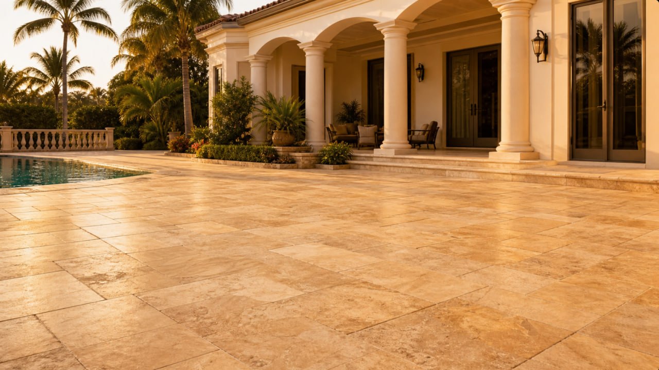
For roughly a decade, cool grey was the default. Steely, blue-leaning greys read as modern, and they poured across patios and pool decks from national catalogs into South Florida backyards. That era is quietly closing. Beige pavers and their warmer relatives, from soft sand to honeyed clay, are moving back to the center of considered outdoor design, and the shift is more than a passing mood. It is a return to a palette that suits how light actually behaves here. For how color fits the wider material choice, see our guide to the best paver material for South Florida.
If you are weighing warm-toned pavers for a Broward or Palm Beach County project, it helps to understand what is driving the change, why warm neutrals belong in this particular climate, and where the objective evidence sits versus where taste takes over.
The color shift, and the cultural signal behind it
The clearest reading of the moment comes from Pantone. Its 2025 Color of the Year, Mocha Mousse, was a warming brown the company described as having an earthy refinement and tied to a broader movement toward the natural world. A color authority does not name a warm brown by accident. It reflects where design sentiment is already heading.
The design press has followed the same current. Editors at outlets covering interiors and patios have begun writing openly about the retreat from cool grey, describing a turn toward grounded tones such as caramel, terracotta clay, and beige. That coverage is opinion rather than measurement, and it should be read as taste, but it is a consistent and dated signal across the field.
Hardscape manufacturers are placing the same bet with their product lines. Several report a deliberate move away from the greys that dominated for so long, introducing warm creamy neutrals and framing beige as a tone that grounds architecture without competing with it. These are manufacturers selling the very colors they describe, so treat the styling as marketing, but the direction is unmistakable when the makers themselves reengineer their palettes around warmth.
Why beige pavers suit South Florida light
Trends travel, but the reason warm neutrals feel right here is regional. Our light is coastal and intense, and it changes character through the day. A surface that looks crisp in a northern showroom can read cold and flat under a Florida midday sun, then go lifeless again at golden hour. Warm-toned pavers hold their character across that range because they share undertones with the landscape they sit in.
South Florida architecture leans on limestone, coquina, and shellstone, and the ground itself is sand and coral. Warm neutrals echo that mineral palette, so a sand or beige terrace reads as an extension of the setting rather than an object dropped onto it. This is design reasoning drawn from Florida-focused design writing rather than a laboratory finding, but it is sound and widely echoed: warm neutrals let bold tropical planting stay the visual focus, so the greens and blooms carry the color while the hardscape stays quiet and grounded.
There is a practical grace note to it as well. Coastal settings accumulate fine calcareous dust, and flat cool greys tend to show every bit of it and to look sun-tired over time. A blended warm palette, with subtle variation from stone to stone, disguises everyday wear and dust more forgivingly. Designers offer this as reasoning rather than tested fact, but it tracks with what these surfaces look like a few seasons in.
The objective layer: heat and fade
Beyond taste, there is a measurable reason warm and light tones perform well under our sun, and it belongs to physics rather than fashion. Lighter surfaces reflect more solar energy than dark ones, so they absorb and retain less heat and stay cooler underfoot.
Daltile’s published Solar Reflectance Index data puts numbers on this. SRI runs from 0 for a standard black surface to 100 for a standard white one, and a higher number means a cooler surface in sun. Within a single porcelain paver line, the warm and light colors cluster high while the darks sit low. Light tones such as Luminary White reach about 65, and warm neutrals land in a strong range: sand and taupe near 55, beige tones around 46 to 51. The dark options tell the opposite story, with a black near 31 and a dark bluestone look around 23. That is the same material and same line, with the warmer colors reflecting far more heat than the darkest ones. For context, the LEED heat-island credit sets a minimum SRI of 29 for pavers, and the warm neutrals clear that line comfortably while several dark colors fall at or below it.
This is the same principle behind choosing surfaces for a hot deck, and we cover it in depth in our guide to pool deck pavers in South Florida. Choose by color first, and warmth works in your favor.
Color longevity is the second objective advantage, and it depends on how the color is made. In quality porcelain and full-body stone, the pigment runs through the entire body rather than sitting only on the surface. Because the color goes all the way through, everyday scratches and wear do not expose a different shade underneath, so the surface holds its appearance longer. Fired porcelain pigment also resists ultraviolet fade well. Framed honestly, this is a durability rationale rather than a lab result for any single product, but it is why a warm porcelain or a full-body stone tends to age gracefully under relentless sun.
A short warm-toned pavers palette guide
Warm neutrals are not one color but a family, and the differences are worth reading in undertone and value rather than by name alone.
-
Sand is the lightest and most reflective, pale and airy, and it reads almost white at midday before warming at golden hour.
-
Beige is the classic warm neutral, soft and grounded, the tone that pairs most easily with limestone and coquina architecture.
-
Taupe carries a bit more depth and a grey-brown balance, giving a terrace weight without going dark.
-
Greige, grey with beige and mushroom undertones, is the natural bridge for anyone easing out of cool grey while keeping some of its restraint.
-
Clay is the warmest and most saturated of the group, earthy and confident, best used where you want the ground plane to carry real color.
The most refined installations rarely rely on a single flat tone. A blended selection across two or three of these creates the subtle variation that reads as natural stone and, conveniently, hides dust and wear.
Grey still has its place
It would be dishonest to declare grey finished. It has not disappeared, and by most accounts it remains a common, even majority, choice while warm tones rise. Manufacturers report that a large share of homeowners still select grey, and warmer greige is itself a way to keep grey’s discipline while softening its temperature. Grey belongs with cool contemporary architecture, with certain glass-and-white facades, and anywhere a client genuinely prefers its clarity. The point is not that warm has won, but that warm has returned as a serious, and often better-suited, option for this region.
Choosing with intent
A paver color is an architectural decision, not a shopping one. It sets the temperature of an entire outdoor room, and in South Florida light it deserves to be chosen against the specific building, the planting, and the way the surface will read from midday to dusk. Warm neutrals, sand through clay, offer a palette that is at once timeless, cooler underfoot, and quietly flattering to everything around it.
If you would like to see warm-toned stone in place, browse finished work in our portfolio or explore our patio and natural stone services. When you are ready to weigh color against your own light and setting, get in touch and we will walk it with you.